The cult cool of Japanese lifestyle magazines

Roula Khalaf, Editor of the FT, selects her favourite stories in this weekly newsletter.
My wife calls it hoarding. I prefer the term “compulsive collecting” to explain the stacks of magazines littered around our living room. Their spines form colour blocks: NatGeo yellow and Monocle black, with a rainbow of Wallpaper copies adding a pop of pastel. I occasionally rifle through them to revisit a travel essay, or reference a designer. But if I need to give my dopamine levels a boost, I turn to my collection of Japanese lifestyle magazines, my Popeyes and my Casa Brutuses.

Like analogue pinboards created by someone with enviably good taste, these Japanese publications pack a dizzying amount of inspiration behind their (eye-popping) covers. They reliably hit the sweet spot between high end and high street, drawing on a smart mix of £1,000-a-night luxury resorts and wallet-friendly boutique stays, Uniqlo basics and expensive vintage denim. I can leaf from an outdoorsy Dior editorial to a tablescaping guide extolling cheap chemistry glassware. And given that most Japanese titles have carved out a deeply niche audience (Popeye, for example, has established itself as a bible for street style-wearing “city boys”, while Casa Brutus caters to Tokyoite apartment dwellers), they’re topically always right on the money. All of it comes wrapped in kaleidoscopic layouts with seemingly hand-scribbled kanji characters dancing over the pages. The only catch: I can’t read a lick of Japanese.


But the language barrier is rarely an issue. Instead of long-winded essays and interviews, most pages are filled with picture-heavy city guides and catalogue-ish fashion spreads that often cover not two but two dozen varieties of slip-on sneakers or puffer jackets – all with snappy captions including brand and price. (Sub)titles with shards of English and pop-up info boxes with phone numbers and illustrated maps provide just enough context.
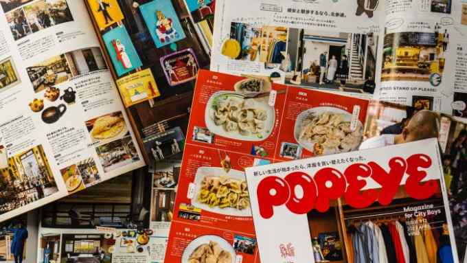
The page layouts too speak volumes. They often break entirely away from the traditional grid design, and throw out the rulebook on editorial consistency, packing an encyclopedic amount of information onto scrapbook-like pages filled with flowcharts, scribbly illustrations, step-by-step guides and playful photography ranging from page-spanning stunners to miniature details. Where a European publication might illustrate a boutique with a single photograph of its interior, Popeye would pile on a handful including cutouts of products and a portrait of the shopkeeper, emblazoned with text balloons. “Whatever stereotypes there are about ‘Japanese minimalism’, the publishing industry [here] loves a very busy aesthetic for most magazines and advertisements,” says Tokyo-based writer and Popeye contributor W David Marx. “Japanese readers love the prescriptive nature of magazines, and you’ll often see people [referencing] them to buy specific items in stores.”


In his book Ametora: How Japan Saved American Style, Marx traces this catalogue-like approach to a serendipitous encounter at a New York City Doubleday bookstore in the summer of 1969. On assignment for the erstwhile Japanese men’s weekly Heibon Punch, editor Jirō Ishikawa and illustrator Yasuhiko Kobayashi stumbled upon copies of Stewart Brand’s counterculture bible, Whole Earth Catalog. It was a moment, writes Marx, that “would not just shape Japanese fashion for the 1970s, but forever change the look of all Japanese magazines”. The encounter inspired the duo to launch Made In USA, a “scrapbook of America”. The format semi-mimicked the Whole Earth Catalog; but Ishikawa and Kobayashi deserted its philosophical undertone completely in favour of a materialist celebration of America’s workwear, outdoor gear and other tools – thereby introducing the lifestyle of America’s youth to a Japanese audience. After Made in USA’s tremendous success, in 1976 the duo joined forces with the late editor Yoshihisa Kinameri (who passed away at 93 last July) to launch Popeye – which, almost five decades later, still flies off magazine racks from London to Los Angeles.


It’s not the only such title that has found a devoted readership abroad. Hypebeasts, sartorialists and Japanophiles across the world frequent international bookstores to pick up copies of outdoor-focused Go Out, menswear catalogue 2nd or lifestyle monthly &Premium, whose English subheading bills it as “The guide to a better life”. Back issues of Free & Easy – a wildly popular handbook on “Rugged Ivy Style” that folded in 2016 – fetch hefty sums on eBay. “I like that there’s no sense of fantasy in these magazines,” says aficionado Josh Peskowitz, a New York-based former editor and brand consultant. “They highlight real people in their real environments, a quite literal depiction of clothing and decor and how they can be applied.”

The Popeye and Brutus issues I hunt down most religiously are the travel specials. Unlike most western travel publications, which leave the hand-holding to guidebooks and focus on aspirational armchair travel, Japanese magazines blur the line between the two. Popeye’s August 2019 issue, for example, is entirely dedicated to Mexico and includes pull-out maps alongside a guide to trinkets to pick up at kiosks in Mexico City, not to mention a deeply researched three-day itinerary across Oaxaca. In the Taiwan-focused May 2023 edition of Brutus, I found concept stores and holes-in-the-wall I never knew existed, despite having spent several summers in Taipei over the past decade. “What these magazines convey is the difference between being a traveller and being a tourist,” says writer-editor and fellow collector Jian DeLeon. “Everything is seen on the same level, but what’s important is the curation of things that are an accurate mirror of regional style and soft-power signifiers. It isn’t about going to the newest restaurants and stores, but the right ones.”
Above all, Japanese magazines prove, with their collective unerring eye for style and detail, that a picture really is worth more than a thousand words. For the rest? There’s always Google Translate.

Comments