FT’s Seasonal Appeal: the volunteer mapmakers saving lives

Roula Khalaf, Editor of the FT, selects her favourite stories in this weekly newsletter.
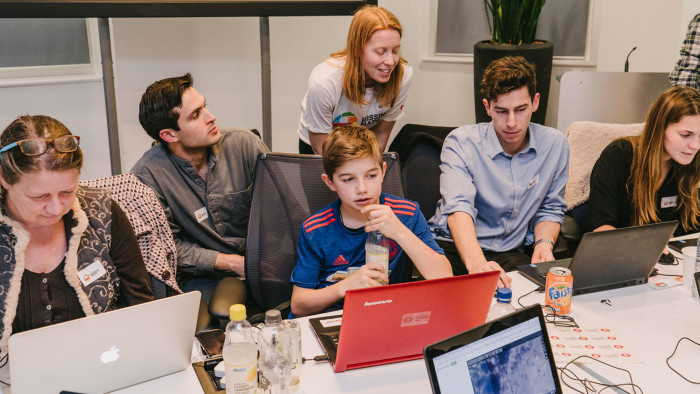
Amany Elbanna and her teenage son Adam have never been to Chad. Today they are more than 2,000 miles away from the Central African desert nation, in an air-conditioned conference room in central London. Yet, hunched over their laptops, faces screwed up in concentration, they are painstakingly creating a map of Bokoro, a small, impoverished savannah town that has suffered unusually high malnutrition and rampant malaria after a recent influx of refugees from neighbouring Nigeria.
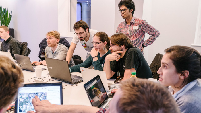
Elbanna, 48, and Adam are volunteer cartographers at a mapping party held by medical charity Médecins Sans Frontières, which has been chosen by the FT as the partner for its seasonal appeal. In an office space donated by civil engineering company Arup, fuelled by pizza, the group, which ranges from geography students to professional architects and office secretaries, are helping chart Chad’s remote Hadjer-Lamis region. Most have never drawn a map before.
The task, 13-year-old Adam tells me, is like a game: mappers look at aerial satellite images to identify buildings and villages scattered like polka dots in the scrub. All they need to do then is sketch shapes and click.
On the ground in Bokoro, MSF runs 15 mobile medical clinics across a dozen villages, where nurses and doctors see as many as 400 sick and malnourished children every day. The digital maps will instantly update in an open mapping database, an unexpected boon for staff trying desperately to reach as many children as their vans can navigate to.
To them, the maps being drawn up on this cold November evening in London are much more precious than a few squares and circles. They have helped Red Cross and MSF volunteers deliver vaccines, drugs, emergency supplies, doctors and nurses to patients and disaster victims globally.
Elbanna, a college lecturer at Royal Holloway, has studied the impact of crowdsourced maps in the aftermath of disasters such as the Nepal earthquake in April 2015. She’s here because she wants to get a glimpse of the other side. “This is a new way of helping from a distance,” she says. “What we do here, it really affects people out there.”

Despite the ubiquity of apps like Google Maps in the west, surprisingly large chunks of our globe remain unmapped. Sometimes, this is because these areas are unsafe for mapmakers to travel through — war-torn Liberia, for instance, or large areas of Rio de Janeiro’s favelas — but often, it’s because it simply doesn’t make commercial sense.
“Google is a commercial maps provider that needs a profit incentive, and they own all the data,” says Pete Masters, a former carpenter who coordinates mapathons on behalf of MSF in the UK. “With Open Street Map, the tool we use, anyone can download data of the world or contribute to it.” As he points out, “Google could turn off all its mapping data tomorrow.”
This London mapathon is one of more than 400 such public events that have been held globally as part of a volunteer project named “Missing Maps”. The mission, set up in November 2014, is an unprecedented collaboration between nine humanitarian charities, including Médecins Sans Frontières and the American and British Red Crosses, to help chart swaths of the world crippled by medical and humanitarian crises, and neglected by mapping corporations such as Google and Microsoft.
To date, Missing Maps has brought more than 18,000 volunteers together and remotely created maps of vulnerable areas, from epidemic-stricken Kinshasa to the Philippines, ravaged by Typhoon Haiyan in November 2013. With staff on the ground forced to rely on hand-drawn charts, out-of-date public records and local descriptions to send out emergency supplies, proper navigation information is a necessity. Often, villages in areas of former civil war have physically moved locations when they get there, wasting precious hours of aid workers’ time.
Masters, 37, refers to Missing Maps as “fairy-dust” — it has no bank account, no office, and no single leader. It exists ephemerally, during the hours when volunteers meet up to plot far-flung roads and towns on to an open-sourced map called Open Street Map, a sort of Wikipedia for maps that anyone can edit. To date there have been 25m edits, mapping 5m buildings and 700,000km of roads. Collectively, they have put more than 4m people living off the grid on to a map. Within hours, local geographers can download these maps and supplement details on the ground. This approach is, Masters says, particularly valuable in “areas of forgotten crises like in Chad or the Democratic Republic of Congo. North Kivu [in DRC] never makes the news but it has ongoing and egregious humanitarian catastrophes.”
By contrast with the starry-eyed Silicon Valley evangelists who often claim their technologies have changed the world, Masters sees the process of filling in missing maps as providing a humbler service to humanity. “We are not trying to claim that a map is saving a kid’s life. It’s just not true,” he shrugs. “Doctors and nurses save kids’ lives. These maps help them do their jobs better.”
In 2014, 29-year-old Jean-Guy Audéoud discovered that perhaps maps could save lives after all. Audéoud, a French mapping specialist at MSF, landed in a small market town in southern Guinea called Guéckédou on March 22, and found himself in the middle of what would become one of the worst emergencies the world had ever experienced.

A few months previously, a two-year-old boy from a local village had died of a mysterious illness, preceded by diarrhoea, vomiting and a fever. Soon after that the toddler’s mother, his three-year-old sister and his grandmother were all dead. In the days that followed, there were further deaths: mourners at the grandmother’s funeral, doctors that were tending the sick family. The hospital in the busy market town, which is close to the intersection of the borders of Guinea, Sierra Leone and Liberia, began to see a growing cluster of cases.
The day after Audéoud arrived, the World Health Organisation announced what his team had already begun to suspect: an outbreak of the Ebola virus, the first ever in west Africa. Audéoud’s immediate job was to pinpoint the most virulent disease hotspots — to chart the villages and towns from which patients were pouring in, so medical teams could throttle the spreading virus. Was the outbreak exploding in a city or in small villages? Was it coming from the direction of the border to Sierra Leone? Or from deep in the forest? How many were in danger?
The maps cobbled together from public sources by Audéoud’s team of geographic experts were woefully incomplete. Filling in the gaps was proving difficult: patients were often too ill to explain where they lived. Those who could sometimes gave ambiguous locations, naming places that could have been either of two villages which shared the same name but were miles apart.
“Outreach teams were heading out on four wheels to reach remote villages, they had just two or three hours to figure out where to go. We were on our knees,” Audéoud recalls. “It was a ticking clock. Every morning, an hourglass would start to flow, if you didn’t have a destination by midday, you couldn’t send out a team to return safely to the base by sunset. Without maps, we were blind.” He realised he was going to need assistance.
On March 24, about 48 hours after arriving in Guinea, Audéoud contacted a volunteer mapping community known as Humanitarian OpenStreetMap Team (HOT), which would later become part of Missing Maps. He urgently requested vital but basic information: where are the villages and where are the roads?
© OpenStreetmap Contributors
“In less than three days, volunteers had provided a complete map of the city, which had more or less 200,000 people, including down to roof level,” he says. “We had a pretty good picture of where all the little villages were, and each of the little houses where people were staying. It is quite amazing if you think about it.”
The early maps allowed MSF to direct its own GPS team on motorbikes into the forest to find the red-hot Ebola-hit villages and mark them on the map. “That all had to be done within 48 hours or we would be too late. When the first case explodes in a village, you need to get there as soon as possible to prevent the contamination of the entire village,” he says.
It was Audéoud’s first taste of the power of an open-source mapping community. “We fell in love,” he says simply.
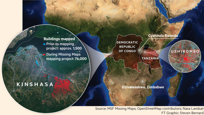
After the Ebola crisis crystallised their value, Missing Maps volunteers have been called upon regularly by MSF’s local teams: they have helped with vaccination drives against cholera and measles in Zambia and the Democratic Republic of Congo, planning medical follow-ups for destitute HIV patients in South Africa, and visualising sprawling Burundian refugee camps on the Tanzanian border.
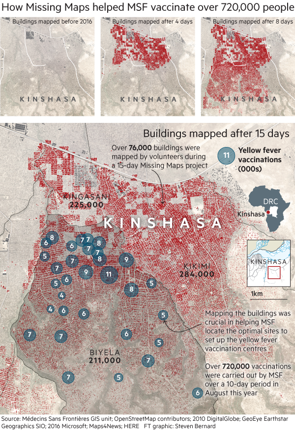
When yellow fever broke out in Kinshasa in the Democratic Republic of Congo in early August 2016, MSF’s team of healthcare experts were flown in with one goal: to vaccinate 800,000 people before the crisis ballooned out of control. The densely populated city, with its pools of tepid, stagnant water, oppressive heat and primitive sanitation, was a mosquito’s paradise. For aid workers, it was a black hole.
“It was my first emergency mission. The maps helped us to orient, adapt and create a monitoring system for vaccine coverage,” says Helena Dembsky, a Slovenian anthropologist who used Missing Maps-created diagrams to organise the campaign. “From the mapping data, you can translate whether you need to reinforce your activities in one region, or focus on a different area. Visualisation of this data helped a lot,” she says.
Within 10 days, the MSF team in Kinshasa vaccinated 720,000 people. “After the crisis, the Kinshasa team said to us, ‘As fast as you were mapping, we were using that data,’ ” says Masters, who ran a mapathon in London at the time of the outbreak. “It’s such an easy story to tell — 720,000 people vaccinated in 10 days. It would have been impossible in that time without maps.”
The root of epidemiology — the study of how diseases spread — can be traced to a single map. When cholera broke out in London’s Soho in September 1854, physician John Snow drew a map of the known cholera deaths and the 13 public wells. He found all the deaths were clustered around a specific water pump on Broad Street. That map changed our understanding of disease forever.
Just a few streets away from the Soho cholera pump, in Arup’s offices, the Missing Maps volunteers, including Amany Elbanna and Adam, are putting finishing touches on their own cartographic efforts, which will soon help tackle diseases in far away Chad.
The before and after effect

Today is Adam’s 13th birthday. Elbanna says she has brought him here to celebrate. “He’s 13 now, so I thought he should try something new,” she smiles. “You learn about new landscapes, new countries. It’s fascinating. Plus, it can be a lifeline.”
Madhumita Murgia is the FT’s European technology correspondent
Photographs: Harry Mitchell; Maps: Steve Bernard
—
All donations received before January 31, 2017, will be matched, up to £300,000, by The ELMA Relief Foundation, a private charitable foundation that supports communities affected by man-made or natural disasters.
Comments