Zone monochrome: design’s new mood
Roula Khalaf, Editor of the FT, selects her favourite stories in this weekly newsletter.
As the New Year dawned, the decorative mood was upbeat. We were in the full throes of an optimistic “green” moment, both literally – with all shades of the colour being top of the paint popularity charts – and metaphorically in terms of its ecological and environmental connotations. Suddenly, however, a very new era of disruption is upon us, and the conversation is rapidly changing. A swing towards monochrome was already on the cards. Whether we’re talking fashion, interiors or current affairs, a black-and-white approach is uncomplicated and easy to assimilate. But its emergence in the spotlight now has a deeper significance. It speaks of realism and straight-talking. A monochromatic outlook never seemed so prescient.
If white is thought of as the ultimate cleanser, and black as the absence of all things, it might seem a natural reaction to consider either a blank sheet or a mass erasure. After all, both offer the opportunity to rewrite the rule book and plan a different trajectory. It’s like performing a complete reset of your computer in an attempt to return it to its factory-clean settings.
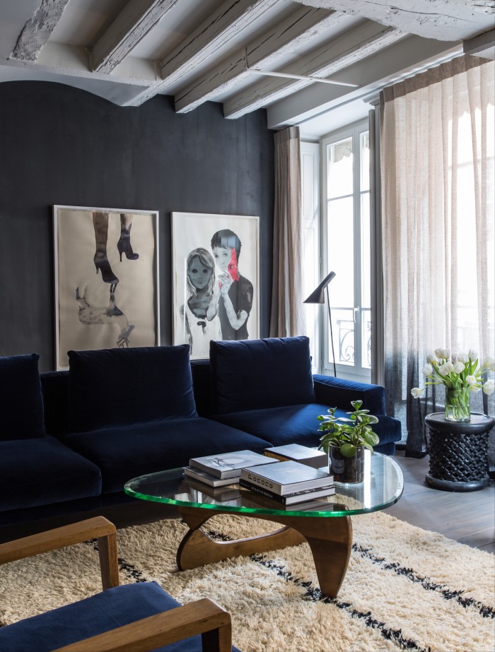
Nevertheless, there are two significant characteristics to the forthcoming monochrome trend. One is that its 2020 iteration is not about single colour blocking, nor even in‑between shades of grey, but the creation of spaces where black and white meet. And the second is nuance – something that supports comfortable confluence and is vital to its success.

The last time monochrome was top of the hit parade for homes was in the 1980s. Then, hard-to-clean matte black surfaces were paired with equally high-maintenance glossy white finishes and stainless steel. Punctuated by expensive (and obvious) designer icons – think a white leather Barcelona daybed and chunky black Le Corbusier armchairs – it was hard and cold, implying prestige and elitism, utterly symptomatic of the “greed is good” era. The look had little to nothing to do with relaxation (or practicality) – more banker’s boardroom than a family living room.
By the 1990s, it was all about one or the other, black versus white. And, as few then would have countenanced an all-black home, white became the go-to for cool, literally bleaching away the distaste of the preceding decade. Notably, 1994 saw the birth of The White Company, a business dreamt up by founder Chrissie Rucker when she couldn’t find affordable home essentials in the colour she wanted.
Certainly, shades of pale can be transformative, reflective and intrinsically peaceful – a seductive option in a hectic world. But this decade also saw the complication of white. Out went plain Brilliant White, and in came Dutch White or Chinese White, even Spanish White, Cotton Street, Pointing and Dimity. Regardless of nomenclature, white interiors remained aspirational as light finishes and furnishings meant constant household vigilance.
The Noughties ushered in the dominance of Scandinavian style. Still resolutely pale and muted, but in theory warmed up with blond wood and gentle smudges of grey. By the dawn of 2010, grey had taken over as the interior stylist’s “colour” of choice. Championed as the new neutral, it signified the very tentative start of a move away from the domination of the Nordic aesthetic. Regardless, in my opinion, wholesale grey was nothing more than the new magnolia, a default choice when you had no idea what else to do. Inevitably, there would be a reaction.
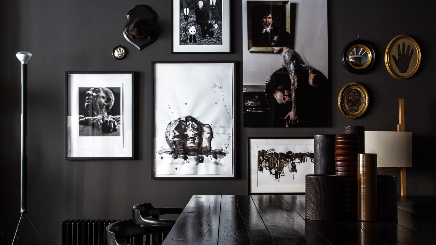
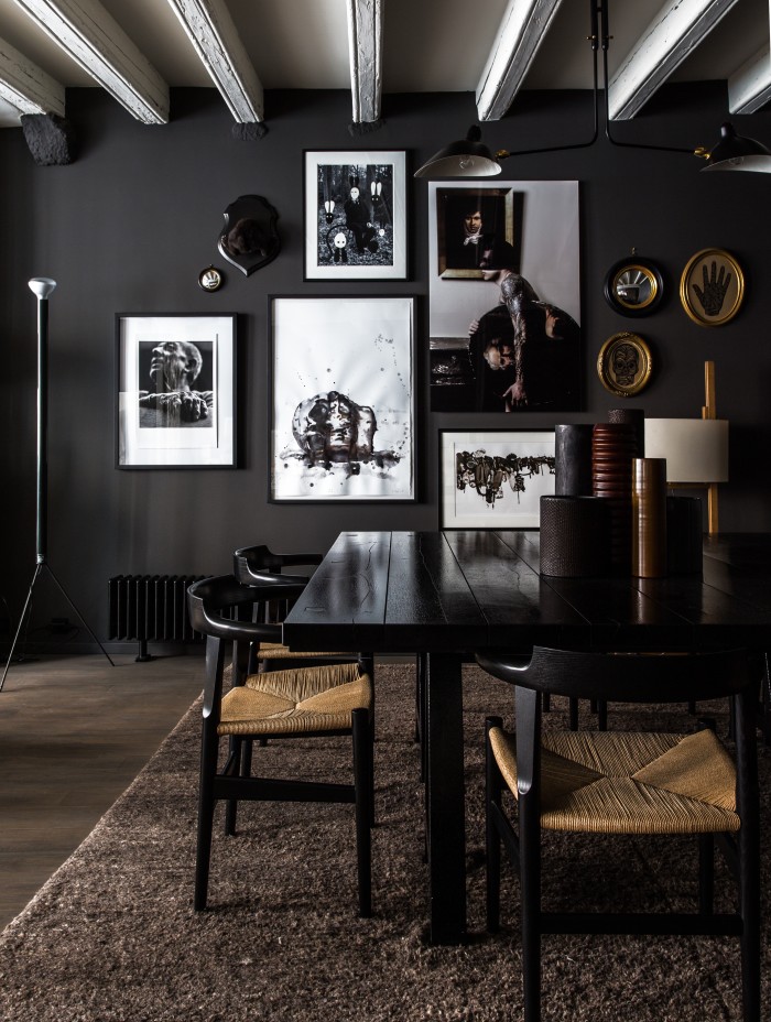
For designer Abigail Ahern, for whom dark decor has now become a highly merchandisable personal signature, 2010 was the year she took her first shop, and then her home, completely to the dark side. “It wasn’t to be provocative,” she says. “I did it in the store and got so excited about how it turned the space around, and how it made me feel, I echoed it at home.” A decade ago this was radical stuff. It marked the beginning of her “arrival” as a tastemaker and interiors magazines fell over themselves to feature her. Interviewed at the time, she described her home as marrying “glam with a dollop of grit” and telling “a story with a dose of drama”.
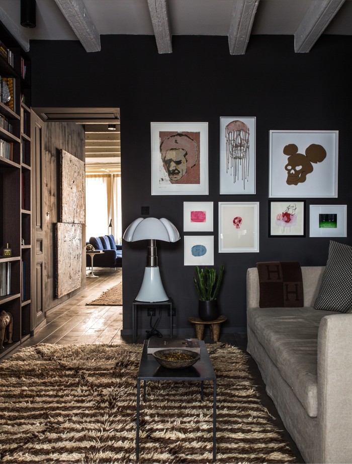
And today? For Ahern the love still burns strong and her home has gradually evolved towards a decor that involves a coordinated series of deliciously dark shades, all from what is now her own-brand paint range of 23 colours: a selection that includes several almost black browns, an umber-infused burgundy, a warm blue black, a deep grey and some depth-of-the-forest fir greens. “It feels luxurious and cocooning and makes the most generic room cosy and sultry,” she says, continuing, “when you go dark, in order to tantalise, you need a few shots of warmer hues to take it to another level.” Combine it with oodles of texture and it can be intensely comforting, as the way it feels is the big idea behind trying all-dark decor in the first place.
As she puts it: “We all want to create warm, cosseting spaces that we can hunker down into, away from the outside world.” It’s a sentiment supported by Lucy St George, co-founder with Jane Rockett of the quirky online emporium Rockett St George and owner of a defiantly black kitchen. “Black can make you feel powerful, strong, glamorous and sexy,” she says, although she reiterates, “the trick is to find a warming shade with the right undertone to create a calm and cosy space.”
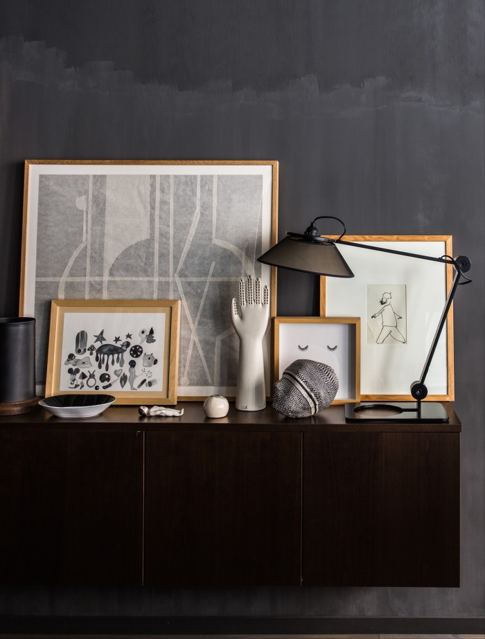
And it’s this issue of undertones, the whisper of another hue behind the main colour, which is the pivotal distinguishing feature of 2020’s monochrome revival. This is the nuance mentioned before, as foreseen by Ruth Mottershead, marketing director at Paint and Paper Library. The company recently debuted a set of six pairs of coordinated white and blacks in association with the Royal Institute of British Architects, such that each couple shares the same subtle undertone from ochre and pink through to blue, green, taupe or grey. “White remains a very popular colour,” she explains, “but consumers are becoming more adventurous in their choices.” The new Monochrome paint card is therefore intended to “allow people to use black with ease and to see it in a new light rather than as the very bold, harsh and difficult colour it has often been understood to be.”
It’s certainly true that previously blacks were nearly all a flat jet black (historically they’d have been coloured with soot), and although white is available in ever more variations, without being able to perfectly tonally coordinate the two, monochrome was a difficult decorative act to pull-off well, especially if cosy comfort was the goal. It could be “a strong and rather stark” combination, agrees Mottershead: “The contrast would be too intense, and unsuitable for many interior spaces.”
According to Sue Timney, for whom black and white has been a sartorial and professional obsession since she co-founded her fabric brand Timney Fowler with Grahame Fowler in 1985, the pending return of monochrome is less to do with it being more user-friendly, than it capturing the mood of the moment. “This current wave comes as we are completely ready for something fresh, clean and simple within interiors,” she says.
And I think she’s absolutely right. Mood, mode and material have perfectly coalesced. So, the time is nigh to revel in the wealth of new decorative possibility now that all those seductively monikered whites have been joined by equally delicious-sounding blacks – think Paean Black, Pontefract, Kohl and Ilex. One of my favourites though, funnily enough, is Zeitgeist from Craig & Rose, one of the oldest paint makers in the UK, dating from 1829. Described as “almost black with a drop of green and the chalkiness of charcoal”, it sounds like an apposite metaphor for the next decade; all we need to go with it is a lovely warm White-with-a hint-of-hope.
Comments