Make your home an ode to joy

Simply sign up to the Style myFT Digest -- delivered directly to your inbox.
Some trends are a direct response to discontent – take the Vietnam war contributing to the emergence of the hippy vibe, for example. Some merely reflect the dominant public interest – leading to the continued rise of environmental concerns, perhaps. Others, though, are a reaction, a thrust against perceived constraint. Think punk, or the rise of dark decor after decades of white. Or, more subtly, the soar in make-up sales in times of strife. We saw this during both world wars, as solace is sought in something easy, affordable and fun. It’s a case of literally putting on a brave face, with lipstick as our metaphorical armour. But whether push, pull or mirror, trends always answer a need.
And now? Get set for a burst of unbridled frivolity! A new mood that represents a moment of release that we can’t help but be intuitively drawn to. After all, a period of sobriety is generally followed by heady abandonment. Denial begets indulgence. A hunger that is now being sated by the triumphant return of full-fat colour and joyous prints all mixed together with enthusiastic abandon.
Rainbow Shock

Colour-obsessed multi-disciplinary artist Yinka Ilori evokes the shades of his African heritage in his new Maximalist Brights collection with Lick Home (paint, £38 for 2.5l). Use blocks of yellow, pink, green and blue across walls and woodwork to get this bold statement look.

But who is responsible for initiating any such shift? Where does it start? Is it the maverick shopper spontaneously seeking new modes of self-expression? And then, in a steady trickle from street to mainstream, those whims become a “thing”? Or is it prompted by the outliers of design who routinely throw off the shackles of commercialism or perceived good taste to do as they wish, thus invariably signalling what’s to come?
Fat Furniture

“Just like a plump baby or a puppy, there’s something very comforting about a rounded, generous shape,” says designer Tom Dixon of his Fat sofa and chair (from £750).

The chunky chair is a huge trend, some brands rebooting 1960s classics such as Cassina’s Soriana (above, from £6,010), by Afra and Tobia Scarpa, others offering modern explorations of form like Moroso’s Getlucky (below, €1,170) by Patricia Urquiola
In truth, it’s a combination of these forces. Even early adopters can’t buy what doesn’t exist. And designers will quickly go out of business if they make what never sells. Yet crucially, for both, any drive towards the new is simply the external manifestation of internal desires. The point is that the muted neutrals and tasteful greiges – or the little black dresses – don’t disappear when the trends pendulum swings towards something more exotic. Interiors queen of taupe Kelly Hoppen is as busy as she ever was, and jeans and a white T-shirt will always be high up on the clothing bestseller lists. Instead, viewed with the benefit of hindsight, trends almost inevitably follow a pattern, as repeating universal themes – joy, fear, utility, optimism or thrift – shift in and out of popular consciousness. The only change is how these themes are realised.
However, we know that something is a potential long stayer when it crosses disciplines. This move to the bright side then is happening not just in the home but in fashion too. This year’s resort collections – not usually as celebrated as the bigger spring/summer or autumn/winter shows – were bursting with colour. Of note, though, was that their super-saturated hues were strategically combined with comfort: picture relaxed, slouchy trouser suits and long patterned dresses in every shade under the sun.
The new mood represents a wave of relaxed euphoria that is nonetheless determined to dispatch any bad memories of recent times. It’s why we’re so ready for the rebooted new series of Sex and the City, all frivolous fashion frolics and paper-thin storylines: lightweight, visually delicious and just the ticket. Likewise, the return of ’90s favourite Changing Rooms – high camp, full-throttle entertainment, albeit with very little to do with liveable design. Then there’s The Matrix 4 with Keanu Reeves reprising his iconic role as Neo – oh, how we crave the blue-pill escapism! And rumours of a female 007 after No Time To Die, the final James Bond film to star Daniel Craig? Bring it on.
Two years ago London-based British Nigerian artist Yinka Ilori’s bold style, inspired by his colour-infused west African heritage, might have been considered too much. Today – yes, please! A new collaboration with paper and paint company Lick sees us presented with a playful mix of rich greens, bright blues, hot pinks, pastel purples and strong yellows, plus wallpapers that blend the lot in maximalism meets architectural motifs. As Lick says, it’s “guaranteed to brighten up your home and your spirits”. And, as Ilori puts it, “I want people to feel emboldened by the palette – to see that you can mix different, vibrant colours together to create rooms that make you feel joy.” This is the pursuit of pleasure via interior design – easy, affordable (gold wallpaper aside) and fun, just like that lipstick.


Yet there’s also something acutely innocent about the appearance of these paintbox brights; something childlike in the decorative hacks popping up on Instagram, all wide stripes on walls and big blousy blooms strewn across upholstery and drapes. To me, it speaks of a yearning for a sort of simplicity as well as the pursuit of joy. The much-touted return to normality is a misnomer. We don’t want to go back to the way things were, we want something better, more nurturing in terms of both planet and people, psychologically, for our wellbeing. And where better to start than at home?
It’s not just the new kids on the block at the forefront of this pivot. Silentnight, one of the UK’s most established bed-makers, is set to launch divans upholstered in bold, juicy jewel colours. It’s a first for the brand, designed to appeal to the increasingly adventurous customers it has identified who are jettisoning neutrals in favour of more standout pieces.
The bright brigade

French brand Magic Circus Editions founded by Marie-Lise Féry brings a playful twist to lighting design – her Pop-Up collection (pictured, £1,660) is all the fun of the circus meets ’70s retro chic. Meanwhile, Italian Lisa Corti’s new colour-saturated Flame collection (top left) references Mallorcan textiles in three intense colours (from €22 for a placemat).


Pierre Frey, the French home textiles company founded in 1935, unveiled its Joie de Vivre fabrics this spring. As a house, it has always been renowned for its eclectic and irreverent approach twinned with fabrics and wallpapers of the very highest quality, and this collection does not disappoint. Drawing on ’50s squiggles, rainbow stripes, the expressive works of Picasso and Matisse, and even mermaids and sunbursts inspired by the seductive indolence of the French Riviera, it is described as a return to “the contours of a luminous landscape between sea and land, transporting us into a cheerful universe”.
Underlying this innocent cheer, however, is an element of bravery. The past 18 months granted us a reprieve from trends as we knew it, which in turn enabled a focus on the bigger issues at stake: the environment, sustainability, community. It also got us off the hook from having to subscribe to external dictates about the latest, newest must-haves. We had a moment to consider what we liked for ourselves. And we may have been surprised at our gusto in selecting unapologetic yellows with which to drench our kitchens, pairing these with shouty wallpapers from ceiling to skirting and florid chintzes (back with a bang) for the sofa while also painting coloured arches on our walls, just because. And why not? The new mantra is, if you can’t have a little fun in the privacy of your own home, frankly what’s the point? We truly recognise now that our domestic environments are as important to our health and happiness as good food and exercise. In truth, I believe they are more important, as it’s pretty hard to create healthy meals in a drab kitchen, and nigh‑on impossible to get motivated to work out in a space that’s dark or dingy. Throw in some light and brightness, jolly stencilling or glorious prints, and you can create a fast-track to happiness.

Mono magic

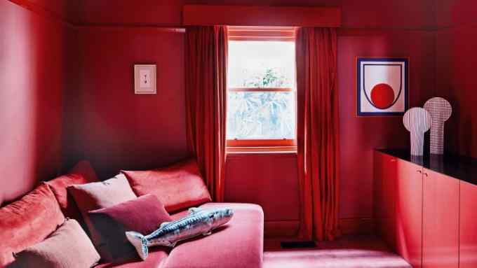
It’s getting intense in interiors: full-volume shades are swept from floor to walls to ceiling, creating spaces that are high drama but also warm and liveable. It’s an aesthetic that is not for the faint-hearted, but easily achieved by layering one colour in various tones throughout a space, as in this media room designed by Doherty Design Studio for a home in Melbourne, shown in Living In Colour (Phaidon) by colour historian Stella Paul and interior designer India Mahdavi.
Ultimately, joy is the opposite of stress, anxiety and loneliness. All states of being that were on the increase around the world even before we knew what the word “pandemic” meant. So would we be heading in this direction regardless of the extraordinary hiatus prompted by Covid-19? Yes. As we’ve seen before, discomfort heralds the new comfort. And this time it’s one that is the interiors equivalent of speaking your truth. In other words, finding the courage to create your own interiors narrative.

Comments