Neutral interiors get a cool upgrade

Simply sign up to the House & Home myFT Digest -- delivered directly to your inbox.
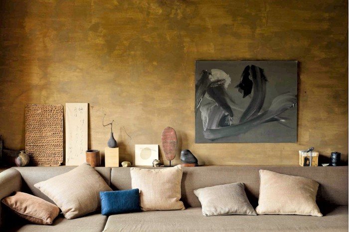
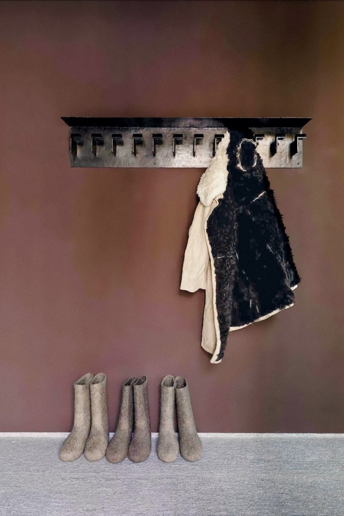
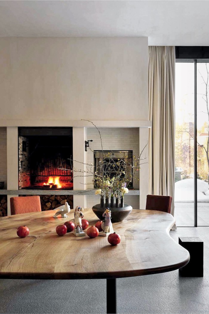
Neutrals. Rarely has there been a word to cause such angst within interior design circles. On the one hand, it symbolises a sense of calm order; on the other, the kind of mundanity epitomised by magnolia paint. But now there’s a new definition on the horizon that has all design camps taking note. It’s less about floor-to-ceiling beige and more, in colour terms, about a mix of the palest whipped cream through to bitter chocolate via oatmeal, pale yellow, butterscotch, ochre and the enduringly popular millennial pink – a faintly old-fashioned tea-rose that is neither overtly feminine nor masculine but somewhere in-between.
Most importantly, though, it represents the sort of effortless sophistication that can act as a soothing reprieve from the “always on” nature of our digital age. We increasingly need our homes to offer respite; to feel that, when it comes to the decor, at least, nothing can distract us or shout unduly for attention.
However, in order to fully understand how and why new neutrals are a potential style signifier, we must take a quick romp through the past three decades of decoration, not least because such a seemingly subdued look appears to be at odds with the prevailing trend for a maximalist approach of bold patterns, rich jewel tones and full-on embellishment.
And yet it’s entirely logical. The last time neutrals were a “thing” was in the 1990s – a decade awash with stealth-wealth minimalism as a direct antidote to the brash excesses of the preceding show-off ’80s. Beige walls, acres of pine and cream leather sofas reigned as Ikea appeared on the scene, capturing the popular imagination with its then revolutionary modern flat-pack aesthetic.
A decade later Scandinavian style was firmly entrenched as the go-to for cool, and decor for the trend-aware was strictly confined to monochrome – with a smudge of grey. Then came the noughties. A surfeit of TV interior design shows espoused individuality over the anodyne anonymity of the previous buy-to-let look, and feature walls and “pops of colour” were feverishly embraced.
Skip forward another decade and everything really starts to heat up, from the climate to our politics. In fact, the past 10 years have arguably been completely characterised by turbulence and upheaval, change and revolution – from the UK’s decision to leave the European Union to the inauguration of President Trump, alongside the rise of the #MeToo movement.
And because design does not exist in a vacuum, this heightened global discontent has found its visual voice as the aforementioned maximalism – a style that reflects reaction rather than nuance. It effectively says, if the world is going to hell in a handcart, then we might as well throw caution to the wind and go out with a bang.
Inevitably, though, just as we witnessed following the greed-is-good ’80s, the swing of the trend pendulum dictates that after any measure of the extreme comes reflection and a need for more rational thinking, which is where we are now. Giulia Molteni, granddaughter of the founders of Italian design house Molteni&C, agrees. “After years of minimalism and then a bit of the opposite, it’s time to return to a balance: pure lines, comfortable colours and a strong link with nature – which translates to natural fibres and organic shapes,” she says.
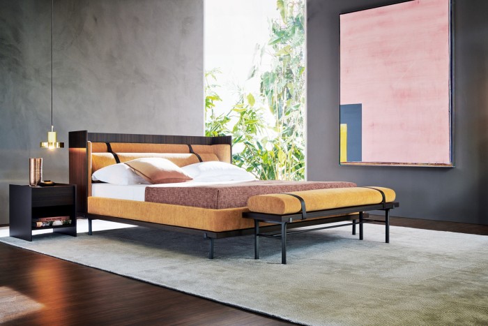
No one does restrained refinement better than the Italians, whose historic emphasis on comfort, quality and attention to detail makes them well placed to reap the rewards of a more measured outlook. Maria Porro is one of the fourth generation of her family to run Porro, a brand known for its modular storage systems. “There’s so much noise in today’s world – an indigestion of images, lights and colours – we need sobriety,” she says. And while this perfectly expresses the inherent restraint of this nation’s contemporary design output, what do they think of neutrals?
Evidently, even in Italy the word causes dissent. “We don’t use the term so much, as it can be misunderstood as a lack of distinctive character,” says Carola Bestetti, head of marketing and communication at Living Divani, a brand founded in 1969 by Bestetti’s parents and characterised by a very spare, lean aesthetic. “We speak instead about a ‘silent elegance’ that fits perfectly in any environment.”
Nicola Coropulis, CEO of Poltrona Frau, a company with a heritage that stretches back to 1912 and which is reputed for its 21-step leather tanning process (the industry standard averages 12 to 15 steps), suggests, “Neutral is better expressed by the word ‘respectful’.”
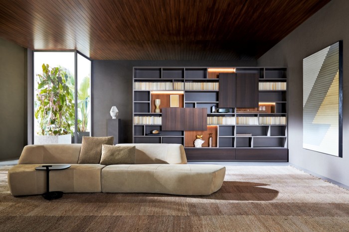
Giulia Molteni, meanwhile, says it is “timeless elegance – the DNA of the Italian lifestyle”, a sentiment with which Roberto Minotti, co-CEO with his elder brother Renato of the impeccably stylish Italian furniture brand Minotti, concurs. “Neutral for us is associated with understatement,” he says. “It has to do with style, but at the same time attitude. It reflects our consistency and our way of designing without excess.”
Poliform, a company that boasts an impressive roster of international names designing its furnishings, describes its brand as “sophisticated luxury yet never ostentatious”. This explains why, of more than 300 fabrics and 28 lacquers it offers to its customers, only a handful of these are what Bronwen Harris, its UK managing director, calls “impact colours”. Its trademark is muted shades of taupe, grey and cream. “At our very core is the most subtle of palettes and our strength is in our selection of finishes, be it the slub of a linen or the embossed lacquers of our kitchens,” she says.
Comfort zones
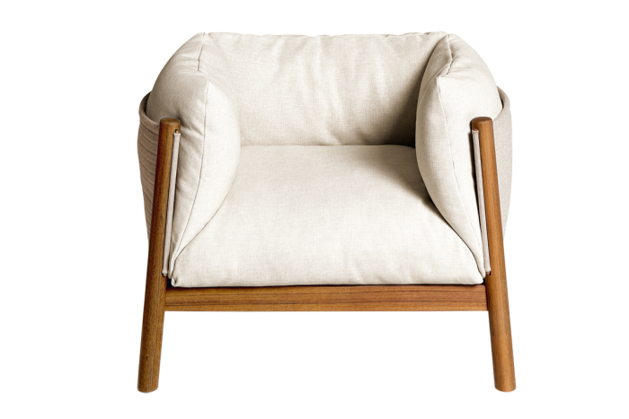
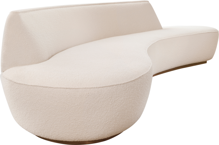
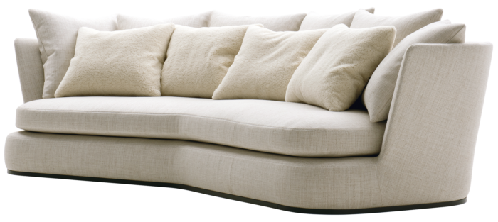
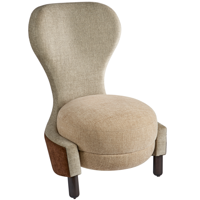
And this is the heart of the appeal of the “new neutrals” in interior design – elegant refinement in both material and finish. Just as with a well-tailored suit, small moves in cut and cloth equate to big statements in style. In furnishing, this means exquisite upholstery in cashmere, wool and velvet mixes or glorious butter-soft leathers, as well as what Carola Bestetti calls “haute couture details” – contemporary yarns intertwined with metallic threads, intricately pleated leather trims and contrast-coloured top‑stitching – all adding extra textural interest.
This is vital, as the rise of the new neutrals goes hand in hand with increased tactility. Designs frequently feature natural materials with masses of texture intended specifically to thrill the fingertips. When our working days are spent umbilically connected to the super-smooth screens of our phones, tablets or laptops, having a supremely touchy-feely home is no superficial conceit. The need to be reconnected in real life via touch has never been more important.
The ethos also speaks of a dedication to craftsmanship. Pieces subscribing to this manifesto never simply roll off an assembly line; they are handmade by artisans, specialists in every one of those detailing techniques. In Italy, this is often carried out by someone to whom the skills have been handed down, parent to child. The very familial nature of this industry is a big part of its continuing success – these are pieces created by people who, from the factory floor to the managing directors, are intimately invested in the company’s future.
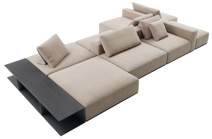
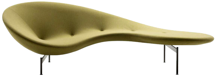
A neutral palette also accentuates the form and shape of furniture, and here, too, there has been a shift in the design approach. Gone are the strict hard lines that used to mean modern. In their place are sofas judiciously crafted with sensuous curves for enhanced comfort (see the Lawson collection by Rodolfo Dordoni for Minotti; Yabu Pushelberg’s Surf sofa for Molteni&C; and the Apollo sofa from the Maxalto collection at B&B Italia designed by Antonio Citterio); or low‑to‑the‑ground and fat and deep to enable snug lounging (such as the Westside system by Jean-Marie Massaud for Poliform).
Body-hugging lounge chairs are also finding favour (such as the Yak armchair by Lucidi Pevere for De Padova; the Gentleman collection by Marcel Wanders for Poliform; or the Angie armchair by GamFratesi for Minotti), while beds feature thickly padded or deliciously oversized wraparound headboards to cradle and cocoon (from Antonio Citterio’s Dike bed for the Maxalto collection at B&B Italia, to Neri & Hu’s Twelve AM bed for Molteni&C).
In truth, neutrals have never really gone away. They are always here, humming steadily in the background of flashier trends, because they are an essential part of any decorative arsenal. We simply find ourselves looking at them anew today because, against a backdrop of constant overload, quiet speaks volumes. “We live in a world that requires us to be constantly updating and evolving,” says Roberto Gavazzi, CEO of De Padova and luxe kitchen, bathroom and furniture systems brand Boffi. “Making a ‘neutral’ choice doesn’t mean having a boring style, but rather it’s a way of being elegant in such a manner that everything is put together well and offered in an interesting way.” In short, it is the design style that we need right now.
Piero Lissoni, art director and designer for many contemporary Italian brands including Porro, De Padova, Living Divani and Boffi, says: “That comes through coherence and the ability to choose the best possible design solution, which is not necessarily associated with colours or forms.” Nonetheless, it’s more than likely that Lissoni will stay within his trademark oeuvre of biscuit, ecru and greige, in the same way as Burberry does with its iconic mac, because most designs with longevity simply look better in classic colours. Regardless, he firmly eschews the neutral moniker. “I would sooner think of myself as being tied to a model of coherent simplicity into which I insert some errors to make the language even more elegant,” he says.
And this isn’t a purely Italian thing. Moroccan-born Anna Zaoui and French native Isabelle Dubern, co-founders of The Invisible Collection, a curated selection of pieces by an illustrious line-up of international interior designers, have seen an embrace of new neutrals too. They believe it stems from a number of factors, including “the sophistication of new fabrics created by manufacturers like Pierre Frey and Rogers & Goffigon providing the perfect backdrop for outstanding art and bold designs” and a desire to showcase “the finest natural materials including rare woods, refined marbles and stones and marquetry”.
But when it comes to neutrals, the last word on how to use them has to go to the undisputed queen of the colourway, Kelly Hoppen, who, regardless of the ebb and flow of trends, has made them her signature for the past 40 years. “A palette of neutrals can provide a serene and harmonious backdrop against which to layer the colour and activity of your life,” she says. “But in order to add richness, depth and character, contrast is absolutely key. It’s true that, if used badly, neutrals can be flat and unexciting. But when layered with differing tones and textures, they can be warm or cool, calm or dark – but always refined, sophisticated and sexy.”
Comments