Konstruktiv at Galerie Knöll, Basel — ‘a gem of a show’

Simply sign up to the Life & Arts myFT Digest -- delivered directly to your inbox.
“A work of art must be entirely conceived and shaped by the mind before its execution. It shall not receive anything of nature’s or sensuality’s or sentimentality’s formal data. We want to exclude lyricism, drama, symbolism, and so on.”
If the manifesto of Concrete Art — from which these lines come — is to be believed, the abstract movement sounds a dry and colourless affair. Yet, as a gem of a show at Galerie Knöll in Basel this week demonstrates, much of the work that emerged under the Concrete umbrella was vibrant, whimsical and adventurous.
The term Concrete Art was coined in 1924 by Dutch Bauhaus heavyweight Theo van Doesburg. By the time he wrote the manifesto in 1930, van Doesburg had fastened on an approach ostensibly void of all metaphysical leanings. As such he seemed to be distinguishing Concrete Art from abstractionists such as Mondrian — with whom he had previously collaborated — who claimed to take spiritual inspiration for their sharp-edged, primary-hued planes.

But as the Knöll show felicitously proves, getting rid of art’s expressive tendencies was easier said than done. The exhibition concentrates chiefly on those artists who gathered around Swiss practitioner Max Bill, who organised the first international exhibition of Concrete Art in Basel in 1944.
Born in 1908, Bill is renowned for graphic design as well as for painting. (Many of the Concrete Art contingent multitasked as designers and architects, which was in keeping with their democratic vision, nourished by Bauhaus teaching, of a world free from hierarchies between creative practices.)
Nevertheless when Bill studied at the Bauhaus in the late 1920s, his teachers included Paul Klee and Wassily Kandinsky. The paintings at Knöll demonstrate that he absorbed those masters’ appreciation for spirit-lifting colour harmonies. The main gallery, a luminous, dove-grey haven, is graced by two of Bill’s diamond-shaped paintings: “Radiation of Yellow Core” (1972-74) and “Radiation of Light-Blue” (1972-73).

Both frame a central square imprisoned by a taut, symmetrical pattern of oblongs and triangles in tropical pastels. The exultant cheer of the colours is intensified by the unyielding design, a complexity that surely emerged from Bill’s conviction — so much less bleak than van Doesburg’s — that concrete art’s duty was “to represent abstract thoughts in a sensuous and tangible form”.
Bill formed the hub of Zurich Concrete Art, a group of artists in the Swiss city whose other members included Camille Graeser, Richard Paul Lohse and Verena Loewensberg, all of whom are on show in Basel.
It is Loewensberg who proves the revelation. Born in Zurich in 1912, the doctor’s daughter trained as a textile weaver. Yet her paintings here are as resolved and memorable as works by far more famous artists. Taking the fierce, radiant geometries that were Concrete Art’s signature, Loewensberg, here represented by two works (both “Untitled”, 1981), chops up her rectangles into tiny Mediterranean-bright swatches then scatters them in broken, stuttering lines against a white ground.
The results are weightless, ecstatic variations on the solid, earthbound graphics to which Concrete Art’s hermetic music was commonly scored. In Knöll’s last gallery, a 1955 painting by Bill, “Emphasis Compounded by Six Zones”, takes a similar approach to Loewenberg, although it allows its fractured pennants to fade at their borders. Possibly this or a similar work by Bill proffered inspiration but Loewensberg’s offerings possess a transcendent confidence that owes no debts.

One of this show’s virtues is the rollercoaster of shape, line and colour fuelled through encounters between different works. Nowhere is this more evident than in the beautiful juxtaposition between “Untitled” (1939), a pencil drawing by Swiss talent Sophie Taeuber-Arp, and “Two Lines Running Parallel” (1946), a wire sculpture by Belgian artist Georges Vantongerloo.
Taeuber-Arp’s drawing traces a trio of lines as they cross each other to form a fat loop, like an untied knot, which floats on the page in airy, untethered solitude. Vantongerloo’s sculpture flows through a near-identical movement, as if the drawing had floated off the wall into three dimensions.
Galerie Knoll should be commended for curating artists who are not, by and large, household names into a display that demonstrates just how deeply the roots of geometric abstraction permeated 20th-century Europe.
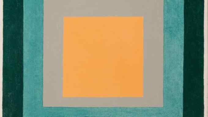
Nevertheless the final word should go to international star Joseph Albers. As a great teacher first at the Bauhaus and then at Black Mountain College in the US, the complex colour theories of the German artist, who was born in 1888, undoubtedly influenced Bill’s generation, as did his paintings with their simmering, saturated, squashed pyramids of colour. Here at Knöll a beautiful example, “Variation on Homage to the Square” (1958), shows Albers stack his signature squares in hues of black, cobalt, aqua, salmon pink and tangerine.
Those tropical tinges remind us that Concrete Art flourished not only in Europe but also in the modernist circles of Latin America. Brazil may be a long way from Basel but next year perhaps Galerie Knöll will tell that chapter of the story.
To July 14, galerieknoell.ch

Comments